Configuring Dashboards in TapRooT® VI
Let’s dive a little deeper and figure out how to have the dashboards show you exactly what you want!
In the screenshot below, we can configure and add/remove the TapRooT® widgets we want on our Dashboard in the TapRooT® software to improve our visibility and bring light to common trends in your organization. There are 25 widgets available in the latest version of TapRooT® VI.
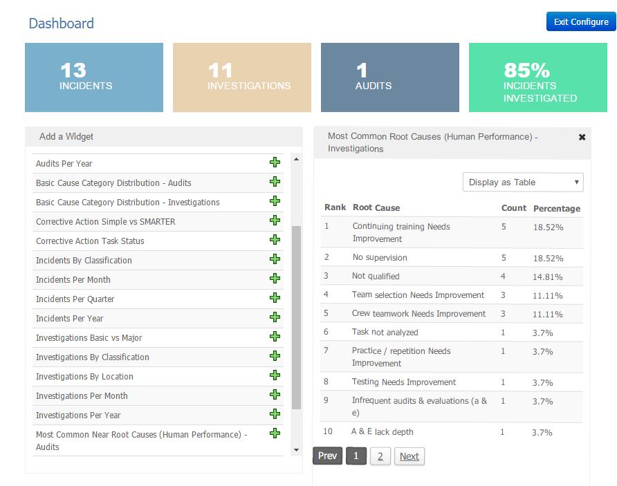
**NOTE Dashboards rely on your Classifications and Locations list. Make sure these lists reflect how you want the Dashboards to appear.
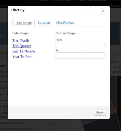
Below you can see a filter which lets you choose Date Ranges, specific Locations, or Classifications.
This lets you magnify specific areas or step back for a broad view of your organization.
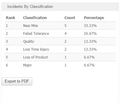
Dashboards can be displayed in many different layouts:
Tables (as shown to the left)
Line Charts
Pie Charts
Pareto Charts
Horizontal & Vertical Bar Charts
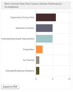
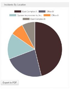
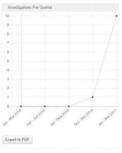
Each Dashboard can be exported to PDF so you can easily add it to any presentation. Quick management tools like these can help prioritize areas for improvement.
Contact us about getting TapRooT® VI Enterprise for your company!
Technically Speaking is a weekly series that highlights various aspects of the TapRooT® VI software and occasionally includes a little Help Desk humor.
Remember, just because it’s technical, doesn’t mean it has to be complicated!