Root Cause Analysis Tips – Building a Better SnapCharT®
Welcome to this week’s root cause tips. This week I would like to talk about the SnapCharT®
As you know, the SnapCharT® is the tool I use to plan my investigation, document my evidence, and present the incident to management. It’s a powerful yet easy tool to help in each of these areas.
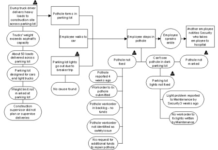
First, let’s talk form. One of the common problems I see when people first start developing a SnapCharT® is trying to get too much information in a small space. I normally start the first page with no more than 4-5 events across the top of the page. As you continue to develop your timeline, you will soon know if you need to more pages, but the software also knows and will create the page for you. It is much easier to add your evidence if you leave plenty of room to work. If you try to put 10 events at the top of your page you will soon run out of space for your evidence. Your chart will be cluttered, hard to digest, and impossible to present with. I want to see a lot of evidence, but I want it to be organized and look good. This will make it much easier to read and understand it as I use the information later for my root cause analysis.
I’ve already said there should be a lot of evidence on the chart. Everything you know about the incident should be there. If you have been to a TapRooT® course before, you know that we always do a final exercise, and as part of the exercise the instructor will approve your causal factors. When I do this, sometimes the discussion begins with a student saying “let me tell you what happened” at which point I say STOP! – I should be table to tell what happened by reading your SnapCharT®! As I review it and start to ask questions, answers pour out of the team, but some of that information is not on the chart. Make sure everything is there. That way you will not forget anything when you do your analysis, and you will get fewer questions when presenting. And, make sure everything on the chart is factual.
Next, wording matters. Don’t be vague, be very specific. Don’t say it was hot; say it was 90 degrees. Use job titles or functions instead of names to reduce blame. Be very clear with your wording so someone who knows nothing about the incident can tell from your wording exactly what you mean. Get good at using the words ‘”did not” to describe things that were supposed to happen but did not; this will make causal factor identification much easier later in the process.
I try to assemble all my evidence directly below the event in a straight line so it is very easy to read and is arranged into nice groups of information. It is permissible to have two rows of information if it makes sense to do that, but I find that this is not always needed. When it is, make sure each row of information goes together in a logical group; for example, you might have a group with all the training information and another group with all the policy information. If you have been to a 5 day TapRooT® course, you might remember when we talk about procedures we say “the burden of written communication is on the writer, not the reader.” SnapCharT®s are no different!
Optionally, you might elect to put safeguards on your chart. Resist the temptation to only put failed safeguards. In fact, showing safeguards that worked on your chart for your management presentations is a great way of showing two things; what is working in the business, and that the incident could have been worse.
If you have been to a TapRooT® course, you have heard this before, but it is worth repeating – draw your lines last! If you draw your lines too early and you end up having to move things around, you will end up having to delete them. Don’t work any harder than you need to.
The last thing I want to address is the use of colors. It is fine to use colors if you want, but be careful and use light colors. If you use a dark color, it may look fine on your computer, but when you go to present people may not to be able to read it on the screen. I have seen people show causal factors in a different color in their presentations, and that is a great way to bring that information out. I say that you cannot go wrong with black and white. Then again, I am obsessed with simplicity, and I know not everyone is wired that way. Do what makes sense for you.
So that’s it for this week. I hope some of this information is helpful. Thanks for readying the blog, and happy investigating.