Technically Speaking – Dashboards in TapRooT® VI
The Dashboard has a new look with the 6.4 release. Let’s take a look at this new look.
In the screenshot below, we can configure and add/remove the TapRooT® widgets we want on our Dashboard in the TapRooT® software to improve our visibility and bring light to common trends in your organization. There are 25 widgets available in the latest version of TapRooT® VI.
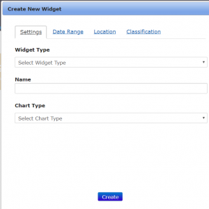
**NOTE Dashboards rely on your Classifications and Locations list. Make sure these lists reflect how you want the Dashboards to appear.
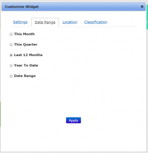
Below you can see a filter which lets you choose Date Ranges, specific Locations, or Classifications.
This lets you magnify specific areas or step back for a broad view of your organization.
Dashboards can be displayed in many different layouts:
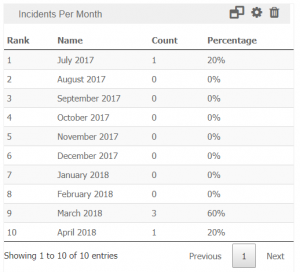
Tables (as shown above)
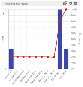
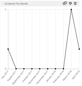
Line Charts
Pie Charts
Pareto Charts
Horizontal & Vertical Bar Charts
Contact us about getting TapRooT® VI Enterprise for your company!
Technically Speaking is a weekly series that highlights various aspects of the TapRooT® VI software and occasionally includes a little Help Desk humor.
Remember, just because it’s technical, doesn’t mean it has to be complicated!