Using a Process Behavior Chart to Prove that Improvement Has Occurred
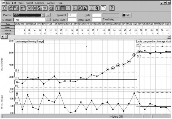
How do you trend infrequently occurring data?
The best way that we have found is the Process Behavior Chart (example shown above).
What does the example above show? The time between incidents with a particular root cause has increased significantly and stabilized at a new, more infrequent level. It changed from an average of 15 days between incidents with this root cause to an average of 60 days between incidents.
Would you like to learn to draw these charts using Excel? Then, attend the Using Trending to Manage Improvement session at the Global TapRooT® Summit.

Would you like to learn to use advanced trending techniques to improve your everyday operations? Then consider attending the 2-Day Measurement, Trending, and Predictive Analytics: How the Best Use Data Every Day to Improve Work Course.


A chart that shows time between incidents with a particular root cause? I don’t get it. What about their process performance.
It could be. Or it could be the time between a particular type of incidents.
Alternatives are Crow-AMSAA plots (my favourite) and Process Reliability plots.
Don’t Poisson Plots like the CROW-AMSAA assume a certain shape distribution of the data? I have always heard that accident data might not fit a particular curve, which is why you use Process Behavior Charts (which don’t assume a particular distribution).