Analyzing Great Britain’s Workplace Fatality Statistics: Up or Down?

Good news! Workplace deaths in the UK are down. Or are they up? Here’s the stats from the UK HSE…
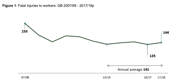
Note that the 2017-2018 are provisional.
These figures don’t include fatal diseases, fatal accidents on non-rail transport systems (for example, driving), and fatal errors in hospital care that kills patients. The items not included are consistent from year to year.
The total number of deaths in the statistic period covered for 2017-2018 were 144. That’s down from 233 deaths in the 2007-2008 year. But it is up from the 135 deaths in 2016-2017.
They also look at the statistics in several different ways.
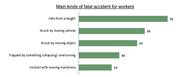
KINDS
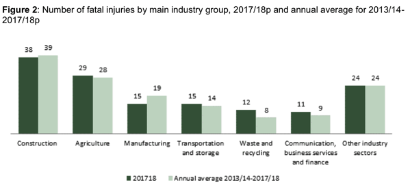
INDUSTRY
AGE

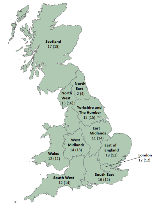
LOCATION
COMPARED TO OTHER EUROPEAN COUNTRIES
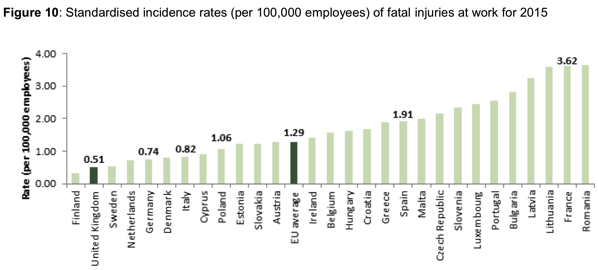
HOW DO YOU EVALUATE STATISTICS?
These different graphs and comparisons should get you thinking about how you evaluate your incident/accident statistics. What kinds of stats should you be trending and how will they help you evaluate your performance improvement initiatives.
For example, in the statistics above, how much of the overall decrease in fatalities is due to less work being performed in the most dangerous industries? The fatality rate has been declining in all industries but if the amount of workers in the most hazardous industries has declined significantly, this might make the overall improvement in deaths across all industries look more significant.
Thus, a more significant trend evaluation is within an industry and within a specific work type.
Why look at work types? Let’s look at the deaths in the Communications, business services and finance sector (11 in the 2017-2018 stats). This sector includes building maintenance and landscaping included in renting and leasing activities (7 of the 11 deaths).
How you count and compare things makes a big difference.
STATISTICAL SIGNIFICANCE
Another question that management often asks is:
“Is that trend significant?”
Let’s look at the total death stats. Are the increases and decreases in the graph in the first figure significant? The UK HSE says:

In the TapRooT® Advanced Trending Techniques Course, we teach a different method to judge a significant trend. We use Process Behavior Charts.
TRENDING THE GREAT BRITAIN STATS
I used the data I could derive from the graphs on the report (note that I am making estimates on the real numbers from the graphs they provide) to draw three new graphs of fatality data. One from the 1980s. One is from 1994 to 2008. And one is from 2009 to 2018. I think you will find the results interesting.
Let’s start with the 1980’s data…

Note that in the early 1980’s the data was fairly stable. I used that data from 1981 to 1987 to set some limits. What we can see is that the average number of fatalities was 471. The upper limit (you would expect no more fatalities than this) was 528. The lower limit (you would expect no less fatalities than this) was 413.
In 1988 the fatalities exceeded the upper limit. There were about 605 fatalities. Exceeding the upper limit leads you to believe that something changed. What was it? The Piper Alpha accident. The 167 people who died in a single accident cased the total number of fatalities to be abnormally high that year.
Also, you may note that the fatalities dropped below the lower limit in 1991. To me, it looks as if there had been an improvement in the UK’s fatalities and the system was driving to a new lower average number of fatalities. Can anyone explain this? Was it really a safety improvement or just an new way to count fatalities? Or did the type of work change?
Next, let’s look at the 1994 to 2008 data…

I used the 1994 to 2007 data to set a new set of limits. The new average number of fatalities was 247. The new upper limit was 322. The new lower limit was 172. The data was fairly flat for 15 years (no data points outside the limits). But in 2009, we had our first point outside the limits low. Again, something was changing. Leave a comment if you have an idea what caused the change.
Now let’s look at 2009 to 2018…
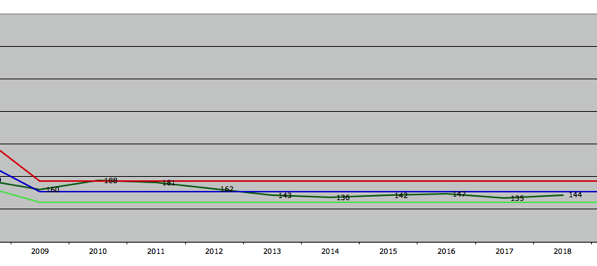
I used the data from 2009 to 2018 to set a new average and limits. The new average number of fatalities is 154. The upper limit is 187. The new lower limit is 121. In 2010 we were one fatality over the limit. Since this was a new set of limits set on data from 2009-2018, we might just say that the system was not stable at the new set of limits yet. Since then the new fatality numbers have been fairly stable with no significant changes.
Trending using Process Behavior Charts is a very good way of understanding significant trends in safety data.
What I don’t like about this county wide data is that it is an average of data across a whole country. What looks like stable data in a large average may be covering up more detailed trends. For example, mining deaths may be declining while construction deaths are increasing and the one downward trend covers up the other upward trend.
Would you like to learn more about Process Behavior Charts and how to use them to understand your safety, quality, or process and equipment reliability? We teach a course once a year on these advanced trending techniques call Trending for Managing Performance. The next course is March 11-12, 2019 near Houston, TX (Montgomery, TX). It will be held just before the 2019 TapRooT® Summit. If you are interested in trending and performance improvement, you should plan to attend both.


