Three Bad Trend Graphs

As Mark Twain wrote:
Figures often beguile me, particularly when I have the arranging of them myself;
in which case the remark attributed to Disraeli
would often apply with justice and force:
“There are three kinds of lies: lies, damned lies, and statistics.”
There’re good ways to use statistics and bad ways to use statistics.
W. Edwards Deming said:
In God we trust, all others bring data.
But no matter how you use data, there are good graphs and bad graphs to use to demonstrate trends.
Many of the graphs you have seen and many of the graphs you currently use are probably bad examples of trending. Why? Because people use the graphs to prove their points rather than to use graphs to understand what is happening. A quote attributed to A.E. Housman may explain the phenomenon:
Statistics are used much like a drunk uses a lamppost: for support, not illumination.
Also, I’ve never seen a management course that teaches using good graphs and the misleading graphs to avoid.
Therefore, let me explain three bad ways to use data and graphs.

3-D Charts
Which bar in the 3-D Bar Chart above is biggest? Would you be surprised to know that 1995 and 1997 are equal? They are. The combination of a 3-D Chart with no vertical scale makes this chart very misleading. Don’t use 3-D Bar Charts.
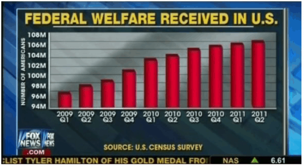
Chopped Off Scales
Do you want to make a small change look dramatic? Just chop off the scale. The Y-axis is chopped off at 94 million in the graph above. It makes the increase in federal welfare received look more dramatic. Yes, it did increase but not near as dramatically as this graph looks (like it has gone up by a factor of four). Chopping off part of the scale can mislead the viewer of the graph. Was this intentional? ???
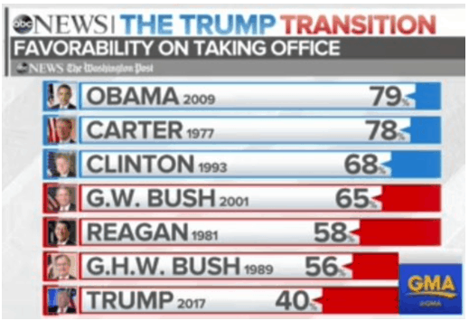
Bars Not To Scale
Isn’t 40% about half of 79%? Why aren’t the bars above to scale? This is’t a chopped off scale. It is just plain wrong. Graphs should communicate the point without reading the numbers.
That’s just three examples. There are many more.
How should you use data to trend and what graphs should you use to display the data? That is part of the content of the 2-Day TapRooT® Trending to Manage Performance Course. What will you learn? How to:
- Display trends (without misleading people)
- Use Pareto Charts to spot where you need to improve
- Use XmR Charts (Process Behavior Charts) to show significant trends
- Use special XmR Charts to trend infrequently occurring data
- Collect reliable data
- Present data to management to help them manage performance
This course is only offered top the public once a year. The next course is March 11-12 in Houston, TX, before the 2019 Global TapRooT® Summit. Get more information at the Summit web site:
https://www.taproot.com/summit/pre-summit-courses/