Trending Oil & Gas Fatality Statistics
Using Process Behavior Charts to See Significant Trends
Have you ever wondered how to judge what is a significant trend and what is just normal variation?
The International Oil & Gas Producers send out a yearly report on safety statistics of their member. The 2018 report was recently released. You can get your copy here:
https://www.iogp.org/bookstore/product/iogp-report-2018s-safety-performance-indicators-2018-data/
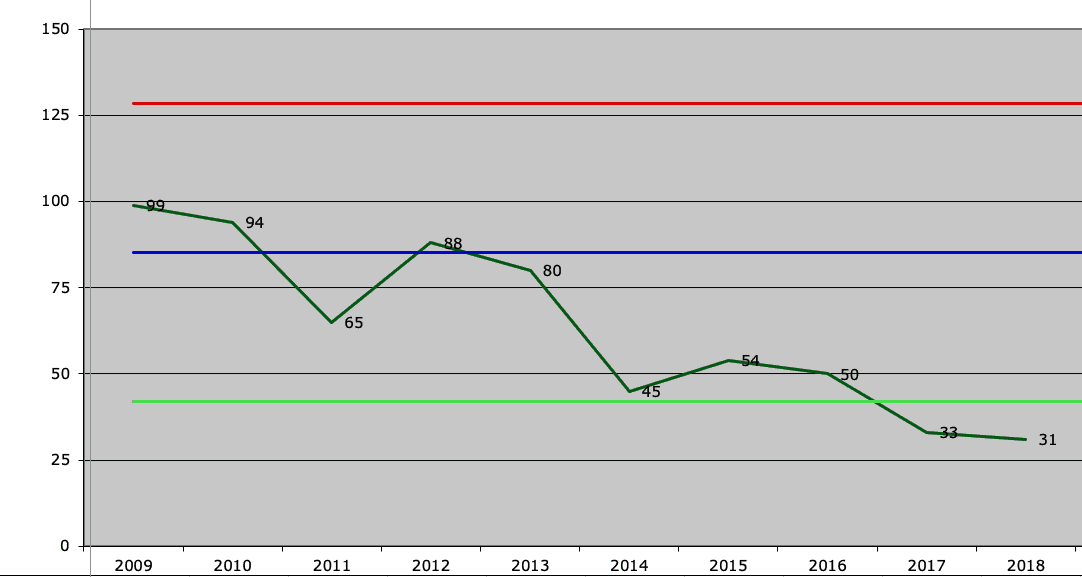
I took the data from the fatalities graph on page 7 and put it into a Process Behavior Chart.
First, I used all the data to set the limits on the chart and it looked like this…
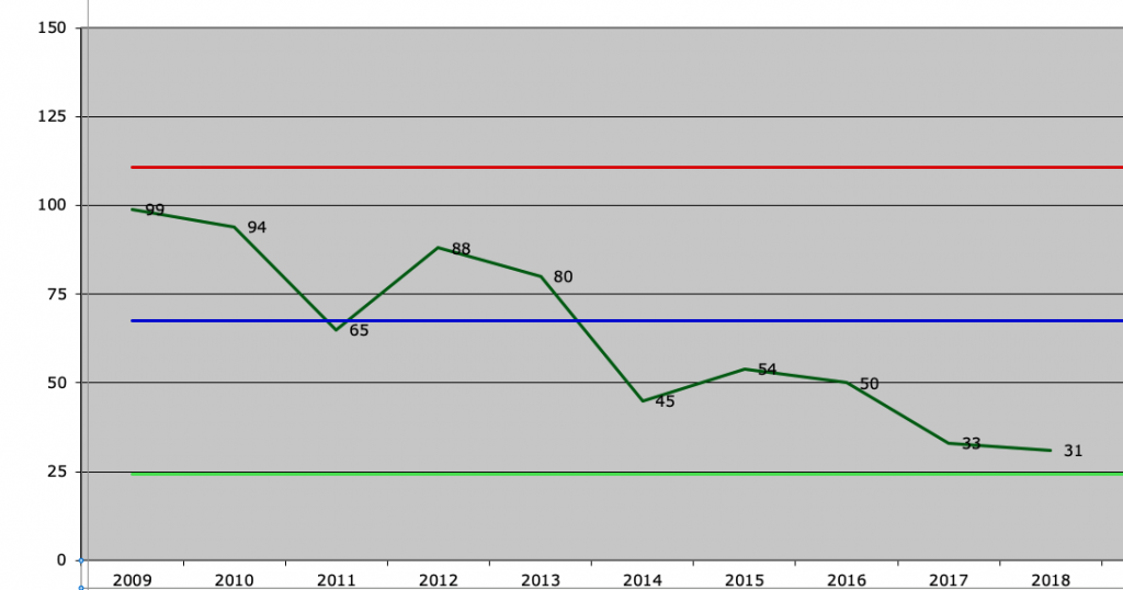
The blue line is the average fatality rate (about 67 fatalities per year). The upper red line is the upper process limit. The bottom green line is the lower process limit.
When I set the limits using all the data, all the data falls within the limits.
However, I know that 2014 was a year of major change in the oil and gas industry. In August, oil prices plunged and the amount of work being performed dropped. These numbers are total fatalities and are not scaled by the hours worked (fatalities per manhour).
Therefore, I thought I would redo the chart and just use 2009-2013 to set the limits. This is the bare minimum to set the limits but I wanted to see how the graph would change. The new graph is shown below…
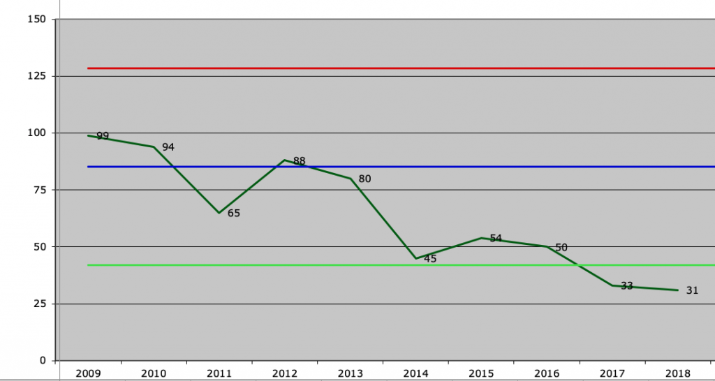
The interesting change is that the lower process limit is now 42. In other words, based on the 2009-2013 data, you have had a significant change in the number of fatalities when you have less than 42 fatalities. This happened in 2017 and 2018.
Now we know that the number of total hours worked is probably less in 2017 than it was in, say, 2009. What should we do? If we had the total hours worked, we could scale the graphs in fatalities/hours worked.
Does any of the above seem interesting?
Have you thought through how you are trending your safety, quality, equipment reliability, or production performance numbers? What is a real trend and what caused any real trends?
We teach trending and Process Behavior Charts in our 2-Day Trending to Manage Performance Course.
You can schedule this training at your site or attend the course that we offer before the 2020 Global TapRooT® Summit.
For more information about the Pre-Summit Course, see:
https://www.taproot.com/summit/pre-summit-courses/
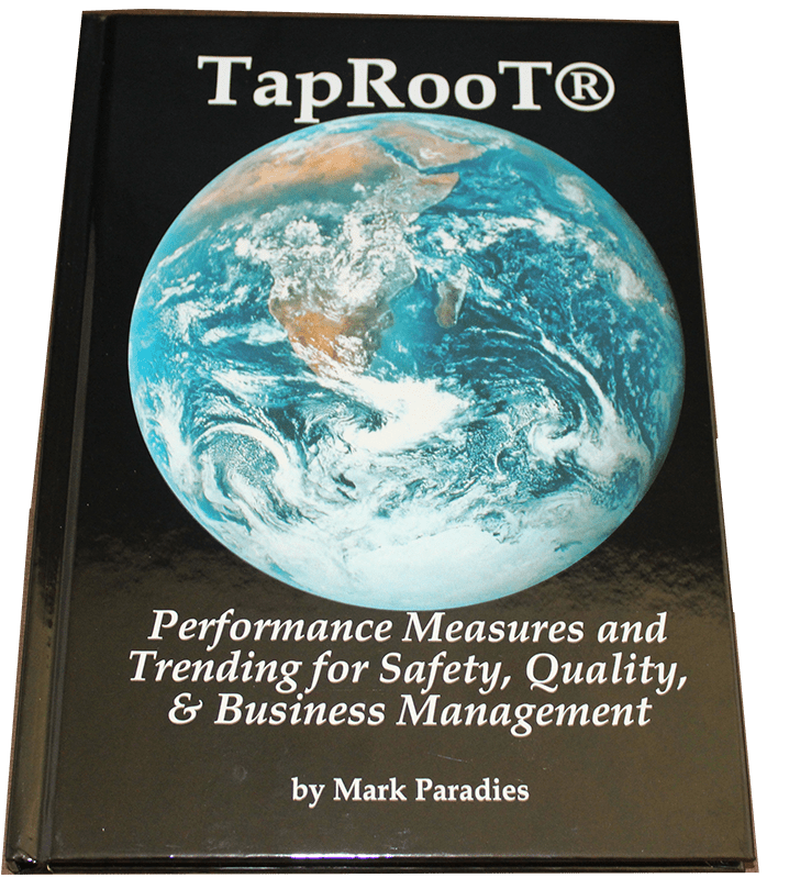
Or you can read our book that explains trending:
Performance Measures and Trending for
Safety, Quality, and Business Management